Medical Team Communication App- Bootcamp Project
The process behind a new function on a medical documentation app to allow ease in communication between teams
-
The Challenge
The Vitality and Well-Being team at a senior living facility had a disruption in communication due to COVID restrictions on in person meetings. I worked with the users (doctors, physical therapists, exercise physiologists) to understand their communication breakdown and came up with a solution to promote more communication with the medical team.
-
Skills used
Methodology: Design Sprint
Technology: Figma
Research: user survey, user interviews, survey tools, A B testing, competitor analysis
Tasks: personas, user stories, user flows. branding, wireframes, prototypes
-
Results
A simple note function similar to email to alert pertinent care providers in changes in patients or need for team collaboration. Better communication lead to better patient care
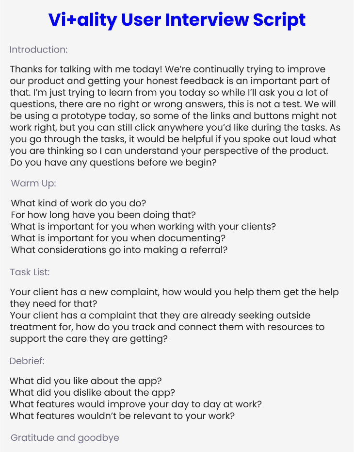
User Research
During the User Research phase, I learned about key players on the medical team to find actionable insights.
The big takeaways were:
Clinicians needed a mobile function to send notes on the go instead of just using the desktop
Clinicians needed a function to directly communicate with members of the interdisciplinary team
User personas developed from research
Exercise Physiologist journey map from working with client to communicating with the team
Information Architecture
The research lead to an actionable insight: the communication path needed to be clear from any team member to another, this needed to be reflected in the user flow
How Might We
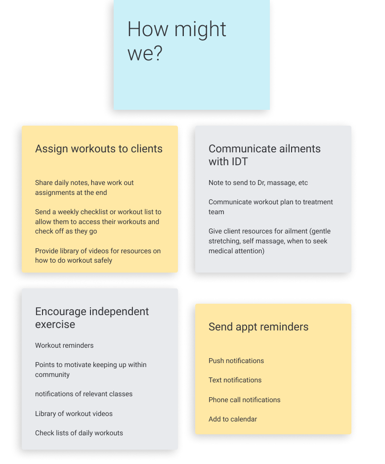
Before sketching, the team brainstormed some HMW questions to identify possible MVP’s and define the scope of the design sprint
Sketching helped to define the scope and determine the MVP of this design sprint
Once the MVP was defined as a mobile communication function between departments, a story board was developed to visualize and empathize with the user
User Flows
User Story 1: As a clinician, I want to send my notes to the team, so we can have clear and efficient communication
User Story 2: As a clinician, I want to reply to notes, so we can have clear communication
Mock Ups
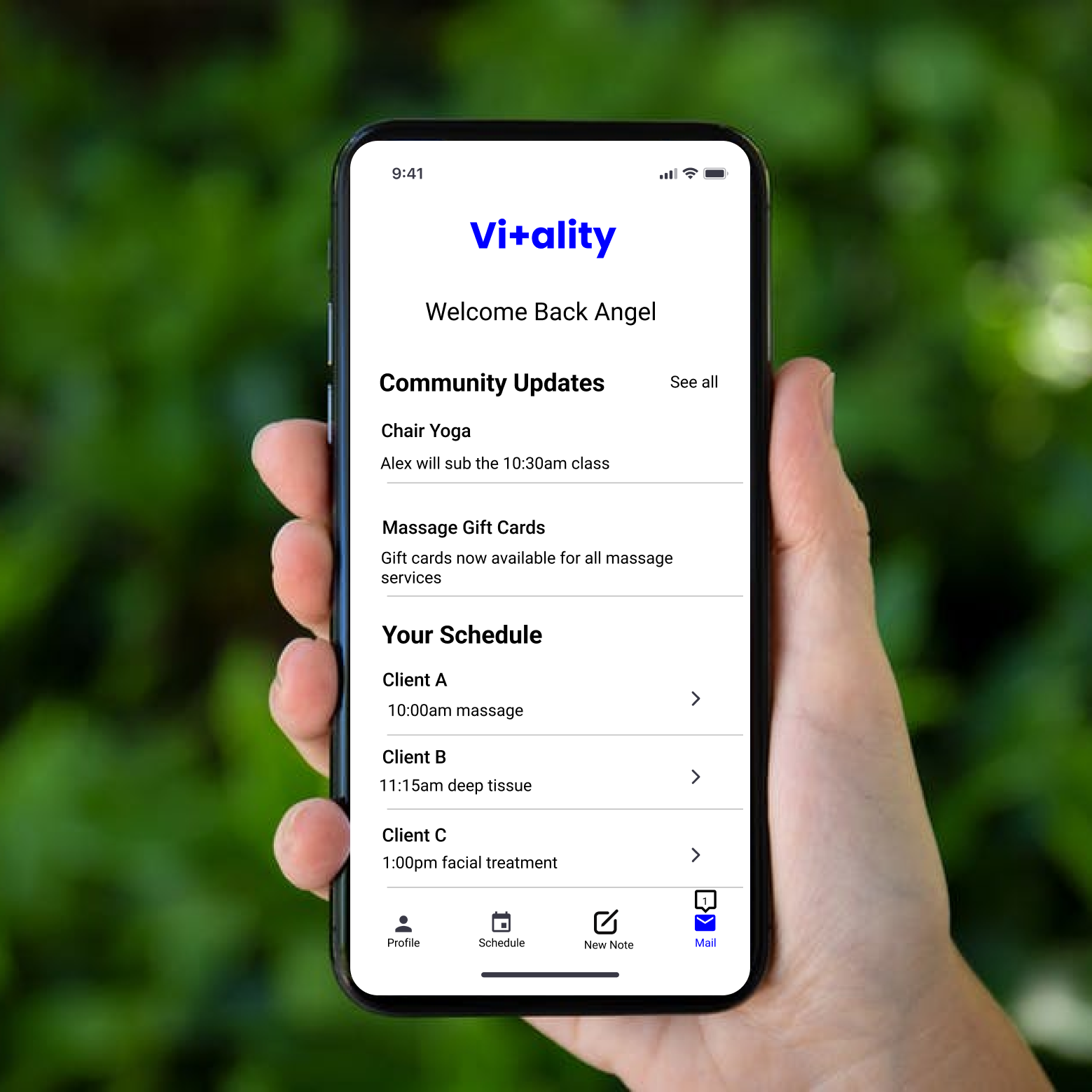
Initial mock ups and iterations of the home screen to decide on the most important functions
Iterations of note screen and notes on inspiration for the layout style
Final iteration of the home screen for this design sprint round
Branding
The app kept on brand with healthcare by having a clean and streamlined look with touches of blue to spark feelings of joy and well being
Prototyping and User Testing
I built a prototype, tested it with our users and updated accordingly. After gaining user feedback, I revised the note saved alert to be more validating for the user. Accessibility was tested for contrast and screen readers. The majority of the users agreed that the app was useful and solved their problem. Some requested further validation of the note sending so the note sent screen was developed in place of a note sent ribbon.

Inbox

New Note

Reply note

Reply

New Message Screen

Note Saved
Accessibility
Keeping all users at the forefront of our design, we added accessibility features such as labels for screen reader and a color blind and contrast testing
Final Thoughts
-
High Points
I got to collaborate and learn from insightful healthcare professionals who lead use to a solution
-
Lessons Learned
Sketching design sprint style helps to keep momentum going and is really fun
-
Takeaways
Keep the user at the forefront, don’t reinvent the wheel, simple practical solutions work!


